2022 Pantone Color of the Year: Very Peri


PANTONE 17-3938 Very Peri
Happy New Year and Happy 2022! It’s that time again to embrace the color of the year carefully decided upon by The Pantone Color Institute after consideration and thought regarding current trends and influences. As a result, the Pantone Color of the Year subsequently influences future trends in design, including those of interior design and fine art.
Pantone describes Very Peri as “A New Pantone Color Whose Courageous Presence Encourages Personal Inventiveness And Creativity.” What better avenue to embrace a color of personal inventiveness and creativity than through fine art and your home décor.
Very Peri is introduced to us a color of transition and a representation of our current times. This particular color of the year is influenced by our digital world and transition to online, something we’ve all had to cope with. 2022 is the year we embrace this, and incorporate it into our lives away from the computer and internet and influences. Continue reading to see how we explore Very Peri through digital installations and artwork from our artists’ own collections.

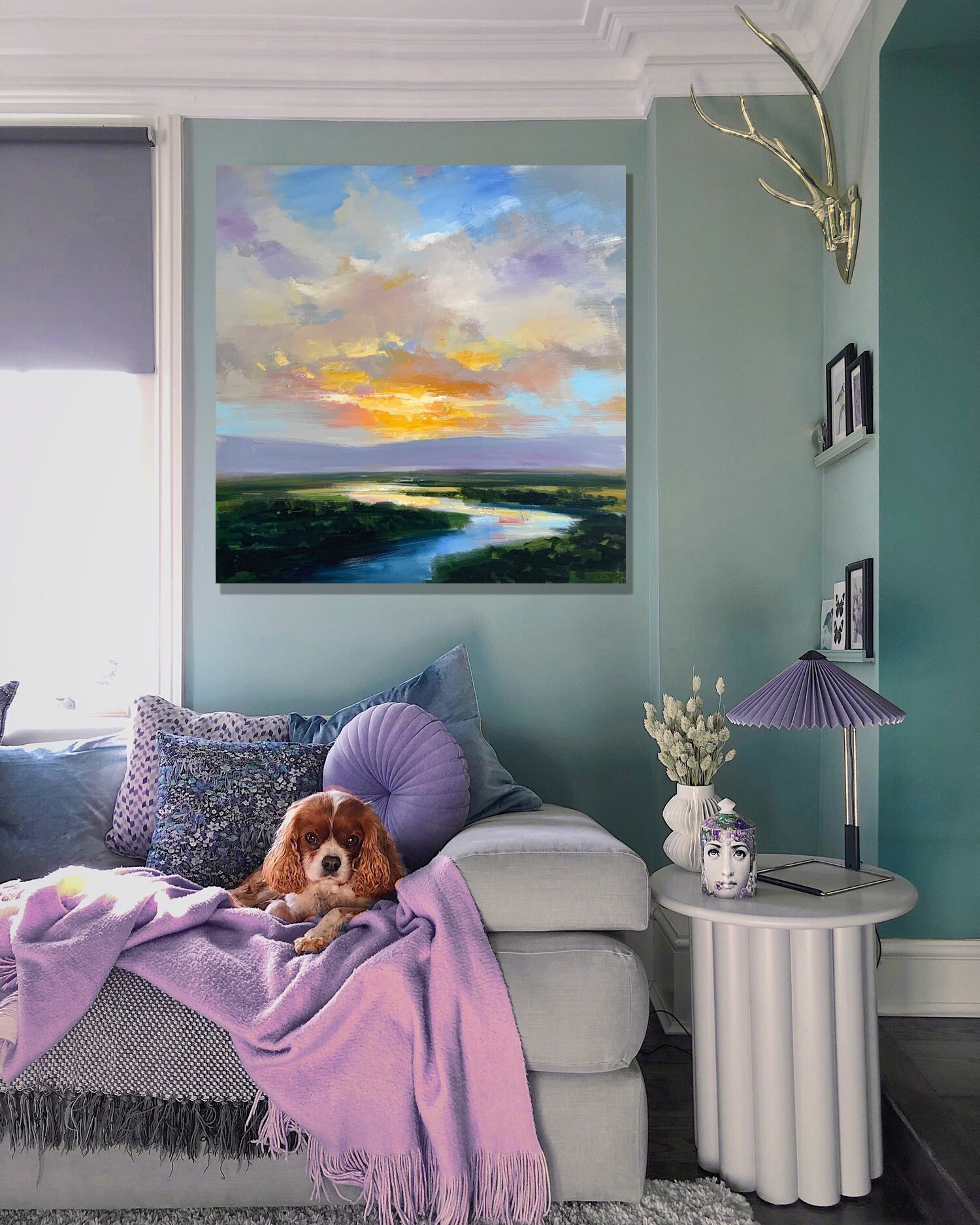
Embracing Trends doesn’t mean going all in. We admit, Very Peri can be a harder color to incorporate especially for those who may be a little color shy.
We love the subtle hints of this soft purple that is included and blended into the piece by artist Shawn Faust, “Warm Blooded”, 36x36.
This is a great and timeless way to consider keeping up with trends but making sure your décor translates for years to come.
Exaggerate color by pairing Very Peri with adjacent colors, for example green and blue. The painting “Purple Trees”, 30x40 by C.E. Ross is a great example of analogous colors working together for a bold and impactful look!
LaChapelle, “Winter Thoroughbreds”